Sunday, December 07, 2008
Friday, November 28, 2008
Wedding invitation
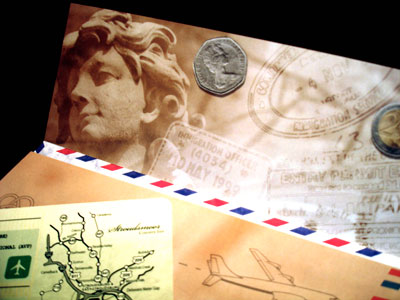
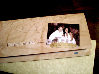
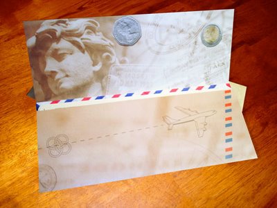
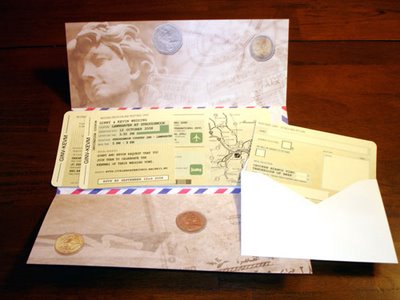 Well I haven't done a lot with drawing lately (crickets anyone). I have been keeping busy with other projects however. Here is an invitation I put together recently. The theme was travel (obviously) and the idea was to emulate a plane ticket. The effort was very well received by both the bride and groom and their guests.
Labels: Graphic Design
Monday, September 15, 2008
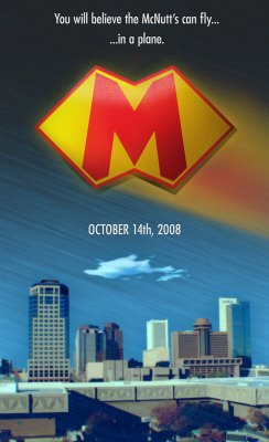 Just a silly graphic to promote our upcoming trip to Arizona. Phoenix is my hometown and I haven't been home in almost four years. This was a take off on the Superman tag-line and poster. Everything except the cityscape made from scratch in Photoshop.
Labels: Photoshop
Sunday, June 08, 2008
Robin Desktop Wallpaper
Another desktop wallpaper.
I'm a big Robin fan and especially the Teen Titans leader era with George Perez's detailed artwork.
Labels: Photoshop, Robin, Wallpapers
Saturday, March 22, 2008
Saturday, February 02, 2008
Spider-man Picture - Work in Progress 2
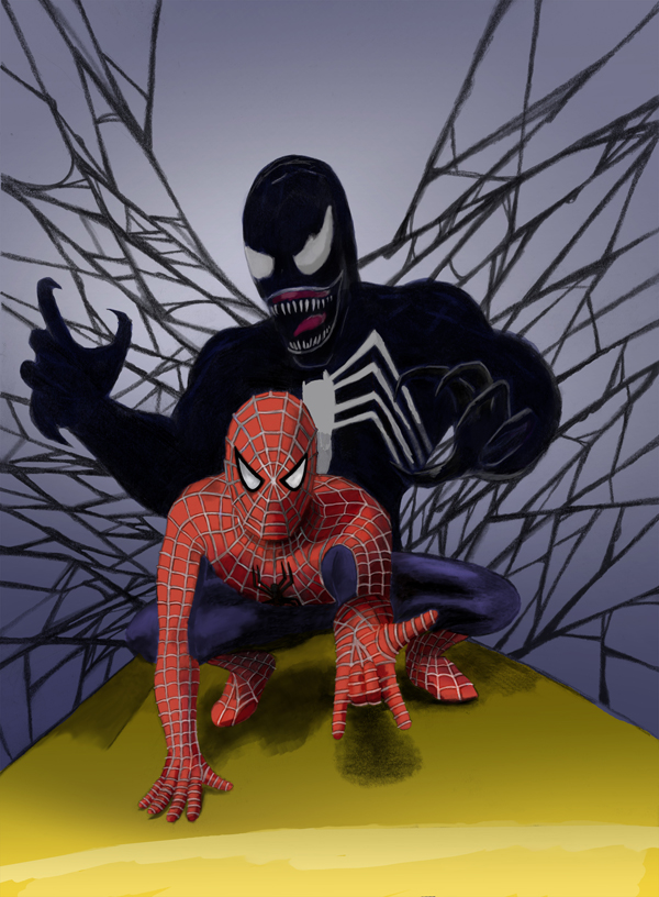
A while back I posted a "work in progress" Spider-man picture. I guess it isn't progress if I don't work on it anymore. However, I have done some work with it. Here is some progress, it's not finished yet, but you can see some of the elements coming together.
I am still finding my way with digital coloring techniques. Trying my best to include the original pencils as much as I can and still get the feel I want for it. Any comments or suggestions? I still have quite a bit I want to do and hopefully can post a finished piece in the near future.
Wednesday, January 23, 2008
More wallpapers
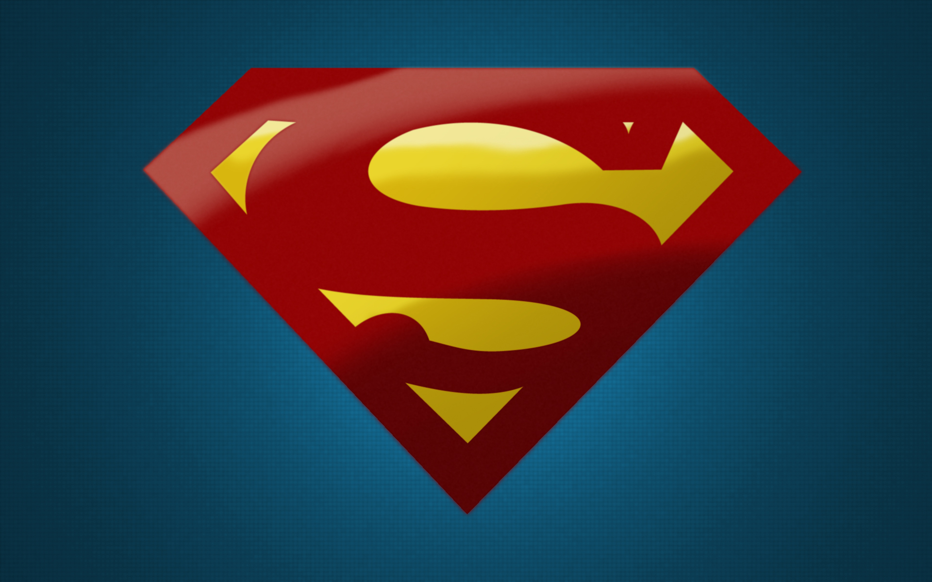
Well I have had some fun with these. Superman and Green Lantern complete my little logo series for now. I have some others to do and will post them time permitting. This exercise reminds me when I first started drawing taking inspiration from the comics and trying to figure out just how my drawing of the character would differentiate itself from the source.
For Superman I shied away from the over beveled look of the recent Superman Returns movie. The fact that Superman is invulnerable, having some sort of hard shield is moot. I tried to make the two colors (red and yellow) appear different in makeup. The yellow catches the light more than the red stuff. Finding the red was a challenge, not too red and neon, but not too dark either. I think it works.
For GL I tried to approximate the power of the ring in the logo. The newer comics have little green willpower logos spilling out of his symbol. Considering the costume is a fabrication of the willpower from the ring the emblem could take on different appearance than say plastic or cloth. His emblem also casts a faint glow of power.
Labels: Photoshop, Superman, Wallpapers

